Color drenching is one of the boldest shifts happening in interior design trends and ideas right now, and it’s surprisingly approachable for a weekend DIYer. The technique involves painting your walls, trim, ceiling, and sometimes even built-in shelving or doors all in the same hue, creating a seamless, enveloping effect that makes a room feel both intentional and deeply immersive. Unlike the traditional approach of keeping trim bright white to create contrast, color drenching leans into saturation and cohesion.
If you’ve scrolled past richly pigmented rooms that look like they belong in an English manor or a high-end boutique hotel, you’ve seen color drenching at work. The good news is that it doesn’t require a designer’s budget. A standard 12-by-12-foot room typically costs between $150 and $400 in paint depending on your chosen brand and sheen, and the project can be completed in a single weekend with proper prep. Browse more ideas in our Home articles for room-by-room inspiration.
This guide walks you through exactly how to color drench a room from start to finish, including which colors work best, how finish selection affects the final result, and where the popular color capping technique fits into the process. Whether you’re tackling a cozy reading nook or a full living room, the principles are the same.
Key Takeaways
- Color drenching covers walls, trim, and ceiling in the same paint color to create a seamless, enveloping look that visually expands smaller rooms.
- Using the same color in different sheens (flat on ceilings, eggshell on walls, semi-gloss on trim) adds subtle dimension without breaking the monochromatic effect.
- Deep, saturated hues like forest green, navy, terracotta, and warm charcoal consistently perform best for the color drenching technique.
- A standard 12-by-12-foot room requires approximately 2 gallons of paint for full coverage on two coats, costing $80 to $160 for mid-range paint.
- The color capping technique, a variation of color drenching that stops color at the ceiling line, suits rooms with lower ceilings where full drenching might feel too heavy.
What Is Color Drenching and Why Is It Having a Moment?
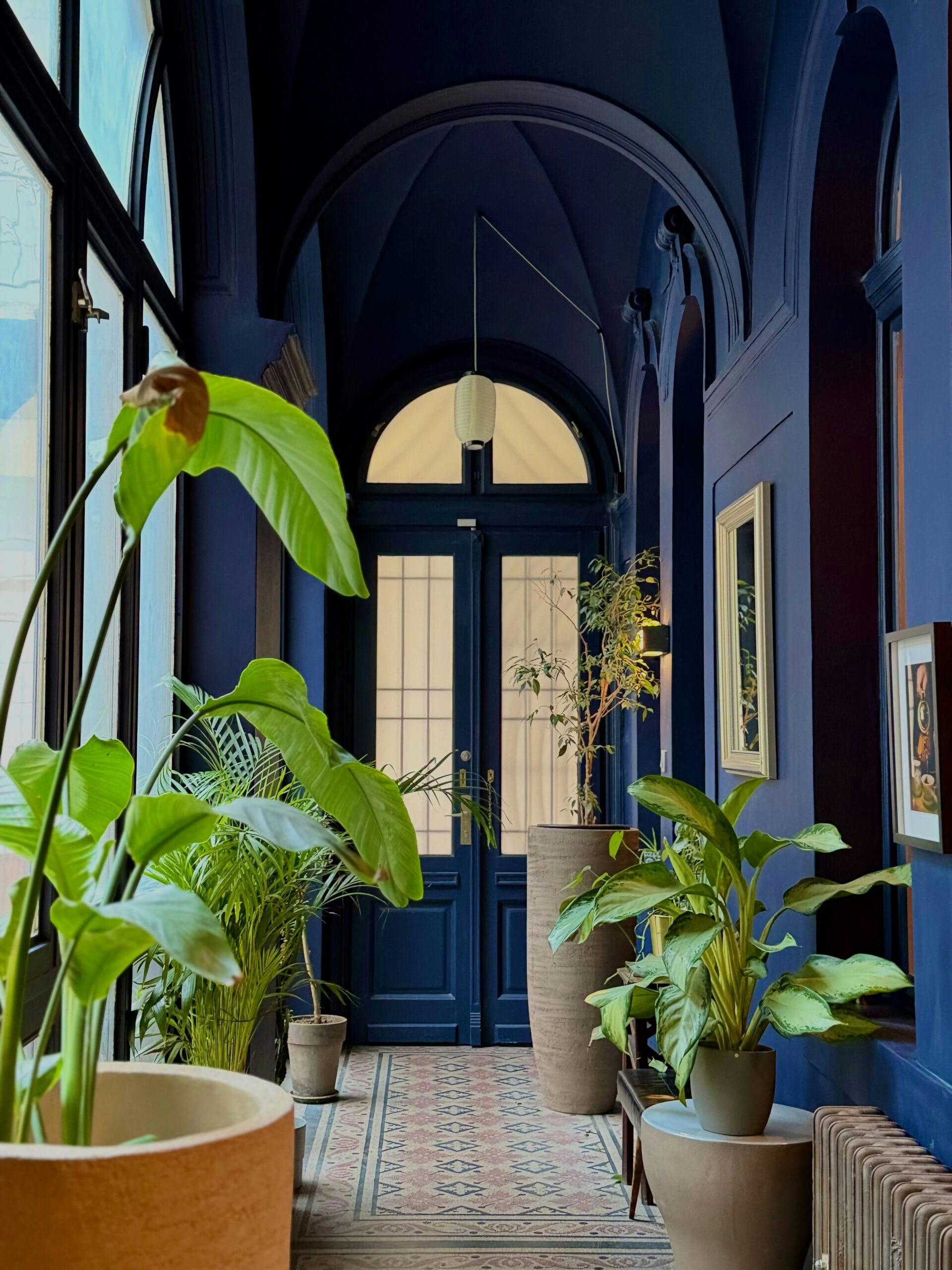
Color drenching is the practice of painting every surface in a room, including walls, ceiling, and trim, in one unified color to create a rich, immersive atmosphere. It removes visual interruptions and makes spaces feel larger and more intentional.
The technique isn’t entirely new. Designers like Farrow & Ball have long championed the all-over color approach in their room guides, and historic English country houses routinely featured rooms where a single deep tone wrapped every surface. What’s changed is accessibility. Better paint formulations, a wider palette of ready-mixed deep tones, and a cultural appetite for maximalist warmth have pushed color drenching from a niche designer move to a mainstream renovation choice.
The psychological reasoning is real. When a room has no contrasting trim or ceiling break, the eye stops searching for edges and settles into the space. This creates a sense of calm and containment that’s particularly effective in rooms used for relaxation or focused work. Research in environmental psychology suggests that saturated, enclosed color environments reduce visual noise and can lower perceived stress, though individual responses vary depending on the specific hue and personal sensitivity to color.
How Does Color Drenching Differ From Simply Painting a Room?
Standard room painting keeps the ceiling white or off-white and leaves trim in a bright neutral to create definition. Color drenching eliminates those boundaries deliberately. The trim, baseboards, crown molding, window casings, and ceiling all receive the same base color. The variation, if any, comes only from sheen level rather than hue. That distinction is what separates a coordinated paint job from a true drench.
Choosing the Best Colors for Color Drenching
The best colors for color drenching are typically mid-to-deep tones with enough pigment to hold up on ceilings without looking washed out. Pale colors can work in very small spaces but often lose impact when applied across all surfaces.
Color selection is where most first-timers make their biggest mistake. Very light colors, think barely-there blush or whisper gray, tend to disappear when spread across every surface. They can make a room feel flat rather than enveloping. The technique genuinely rewards commitment to color.
Top Color Families That Consistently Work
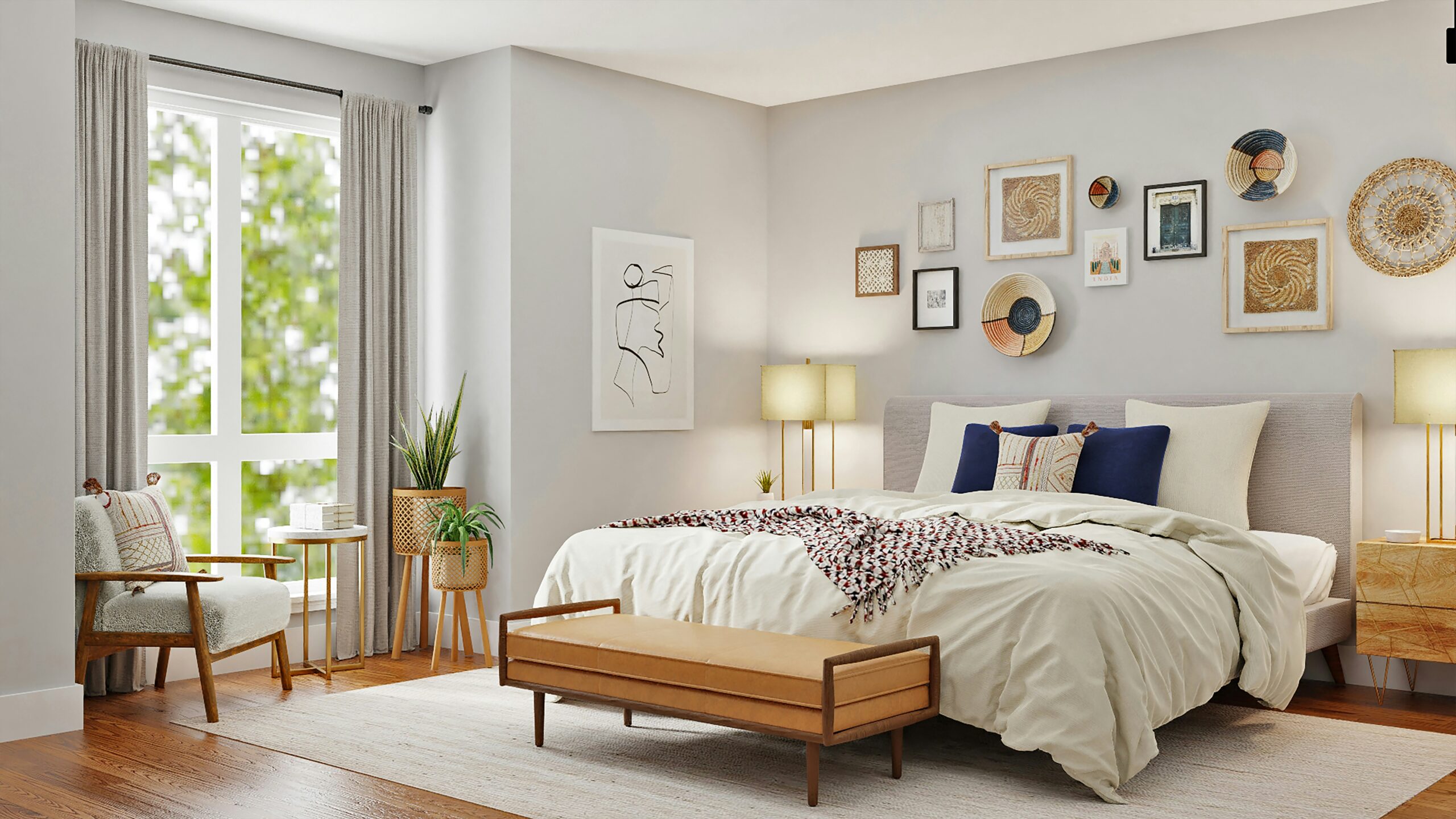
Forest greens and sage tones are among the most popular color drenching ideas for living rooms and libraries. They read as natural and grounded, and deep greens in particular gain richness when they wrap a ceiling. Navy and slate blues create a dramatic, cocoon-like effect that works well in bedrooms and dining rooms. Terracotta and warm earthy reds are having a sustained moment for reading nooks and entryways. Warm charcoal and off-black shades are technically neutral but behave dramatically in a full drench, especially with brass or warm wood accents. Dusty mauves and plum tones layer beautifully in smaller rooms where the saturation feels intimate rather than overwhelming.
Colors to Approach With Caution
Bright, high-chroma colors like fire-engine red or electric yellow tend to become fatiguing when they cover every surface. They can work in powder rooms or closets where exposure time is short, but in a living space they often require more design experience to balance well. Cool, stark whites drenched across all surfaces often miss the mark entirely since the effect blends into standard painting rather than a deliberate technique.
How to Color Drench a Room: Step-by-Step
Successful color drenching requires careful surface prep, the right order of operations, and sheen selection that adds subtle depth without introducing noticeable color variation. The difficulty level is moderate, and a typical room takes one to two days.
What You’ll Need
For a standard 12-by-12-foot room you’ll need approximately 2 gallons of your chosen color in at least two sheen levels. Plan for flat or matte finish on the ceiling, eggshell on walls, and semi-gloss or satin on trim. You’ll also need painter’s tape, a high-quality angled brush for trim work (a 2.5-inch sash brush works well), a 9-inch roller with a 3/8-inch nap for walls, and a smaller roller for ceilings. Drop cloths, sandpaper (120 grit for light sanding between coats), and a good primer for unpainted or patched surfaces round out the supply list. Budget $150 to $400 total depending on paint brand and room size.
Step 1: Prep the Surfaces
Wash walls with a TSP substitute solution to remove grease and dust. Sand any glossy trim lightly so the new paint can grip.
⚠️ Safety Warning: TSP (Trisodium Phosphate) and its substitutes are powerful chemical cleaners. Always wear heavy-duty rubber gloves, protective eyewear, and long sleeves during application. Ensure the room is well-ventilated by opening windows or using exhaust fans to avoid inhaling fumes.
Fill nail holes and cracks with spackling compound, let it dry fully, then sand flush. Tape off floors and any surfaces you’re not painting. If you’re working with a very dark color over a light existing wall, apply a gray-tinted primer first to avoid needing four or five coats to achieve full coverage.
Step 2: Paint the Ceiling First
Always start at the top. Roll the ceiling with your flat or matte version of the color, cutting in carefully around the perimeter with your angled brush. Two coats are standard. Let each coat dry for the time specified on your paint can, which is typically two to four hours for latex paint, before applying the next.
Step 3: Paint the Walls
Cut in along the ceiling line, corners, and trim with your brush before rolling. The key here is not worrying about a perfect line where the wall meets the ceiling since both surfaces will be the same color. Roll walls in a W pattern to distribute paint evenly. Apply two coats.
Step 4: Paint the Trim Last
Trim gets your semi-gloss or satin version of the same color. Use your angled brush and work steadily. The slight sheen difference will catch light differently from your walls and ceiling, which adds dimensionality without color contrast. This is the detail that separates a polished drench from a one-note paint job.
What Is the Color Capping Technique?
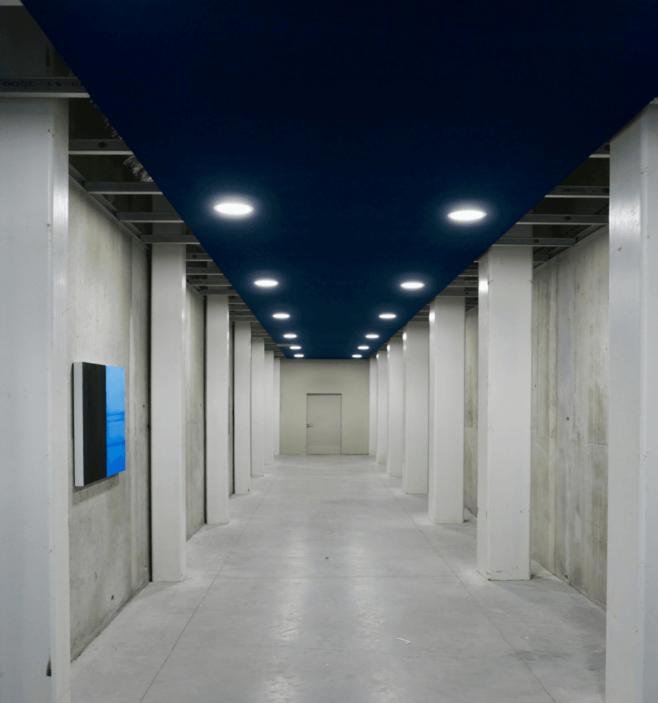
The color capping technique applies deep color to the walls and trim while leaving the ceiling white or a lighter neutral, essentially “capping” the color at the ceiling line. It’s a less intense alternative to full color drenching that suits rooms with lower ceilings.
Color capping makes sense when you want the grounded, intentional feeling of a color-drenched room but have a ceiling height below 8.5 feet where full drenching might feel oppressive. It’s also a useful bridge technique for people who love the look but aren’t ready to commit to painting the ceiling. The walls and all trim elements, including baseboards, window casings, and door frames, receive the full saturated color while the ceiling stays light. The result still reads as cohesive and deliberate, just slightly more airy.
Color Drenching vs. Color Capping: A Quick Comparison
| Feature | Color Drenching | Color Capping |
|---|---|---|
| Ceiling included? | Yes, painted the same color | No, left white or light neutral |
| Best ceiling height | 8.5 feet and above | 7 to 8.5 feet |
| Visual effect | Fully immersive, cocoon-like | Grounded but airier |
| Difficulty level | Moderate | Easy to moderate |
| Paint required (12×12 room) | Approx. 2 gallons | Approx. 1.5 gallons |
| Estimated cost (mid-range paint) | $160 to $400 | $120 to $300 |
| Best room types | Libraries, bedrooms, dining rooms | Living rooms, kitchens, entryways |
Alternative Perspectives
Not every designer is a convert. Some traditionalists argue that color drenching flattens a room’s architecture, removing the visual definition that makes crown molding, wainscoting, or detailed casings worth having a perspective often explored inArchitectural Digest features on historic home preservation. If you’ve invested in ornate millwork, a contrasting trim color is one way to make sure that work stays visible and appreciated.
There’s also a practical resale consideration. Heavily saturated, all-over color is a personal statement, and some real estate professionals suggest that buyers respond more neutrally to lighter, more conventional paint schemes when touring homes. If you’re planning to sell within two to three years, color drenching in a deep hue may require repainting before listing, which adds to your total project cost.
For renters, color drenching is generally not an option without explicit written permission from a landlord. Even with permission, the cost of returning walls to a neutral shade before move-out should factor into the decision.
“The use of a single enveloping color across all planes of a room is one of the most powerful tools a designer has for creating psychological warmth and spatial coherence. The technique has deep roots in historic English interior design and is experiencing a well-deserved revival.” According to Farrow and Ball’s published design guidance on monochromatic rooms.
“Color influences perception of space, warmth, and even time spent in a room. Saturated, enclosed environments tend to be experienced as more intimate and slower-paced than high-contrast or neutral spaces.” According to research published through the Environmental Design Research Association on color and spatial perception.
Disclaimer. DIY projects involve risk. Always follow local building codes and safety regulations. Consult licensed professionals for electrical, structural, plumbing, or gas-related work. Results may vary.
FAQ
Counterintuitively, color drenching often makes a room feel larger rather than smaller. By eliminating the visual breaks between wall, trim, and ceiling, the eye isn’t interrupted by contrasting lines and tends to read the space as more continuous. Very dark colors in very small rooms can feel cave-like, but that’s often the desired effect. If you’re concerned, test your chosen color on a large poster board and observe it at different times of day before committing.
You should use the same color but a different sheen. Ceilings do best with a flat or matte finish because it hides surface imperfections and doesn’t reflect glare from overhead lighting. Walls typically get eggshell, which is slightly more durable and washable. Trim benefits from satin or semi-gloss for hardness and cleanability. Many paint brands will mix your chosen color in multiple sheens from the same base formula, so ask your paint counter to do exactly that.
Color capping applies the saturated color to all walls and trim but stops at the ceiling line, which remains white or a lighter neutral. Full color drenching brings the same hue onto the ceiling as well. Color capping is a gentler version of the technique that works better in rooms with lower ceilings or in spaces where you want a little more light and openness overhead. Both approaches include painting the trim in the wall color, which is the key departure from traditional painting methods.
Plan for a minimum of two coats on every surface. Deep or highly saturated colors, especially those going over a lighter existing wall color, may require a gray-tinted primer plus two coats to achieve full, even coverage. Skipping primer when painting a dark color over a very light or uneven surface often results in patchy coverage that still shows through even after two finish coats. Budget an extra half-day for priming if you’re making a significant color shift.